FC BARCELONA
BRAND IDENTITY & DESIGN SYSTEM
FC BARCELONA
FC Barcelona isn’t just defined by how it looks - it’s defined by how it plays.
The challenge was to translate that identity into a visual language that could live across every touchpoint, from broadcast to stadium to social.
The approach rooted the system in the philosophy of tiki-taka - a style built on speed, rhythm and constant movement. Instead of treating this as a visual reference, it acted as the behavioural principle to drive the entire design language.
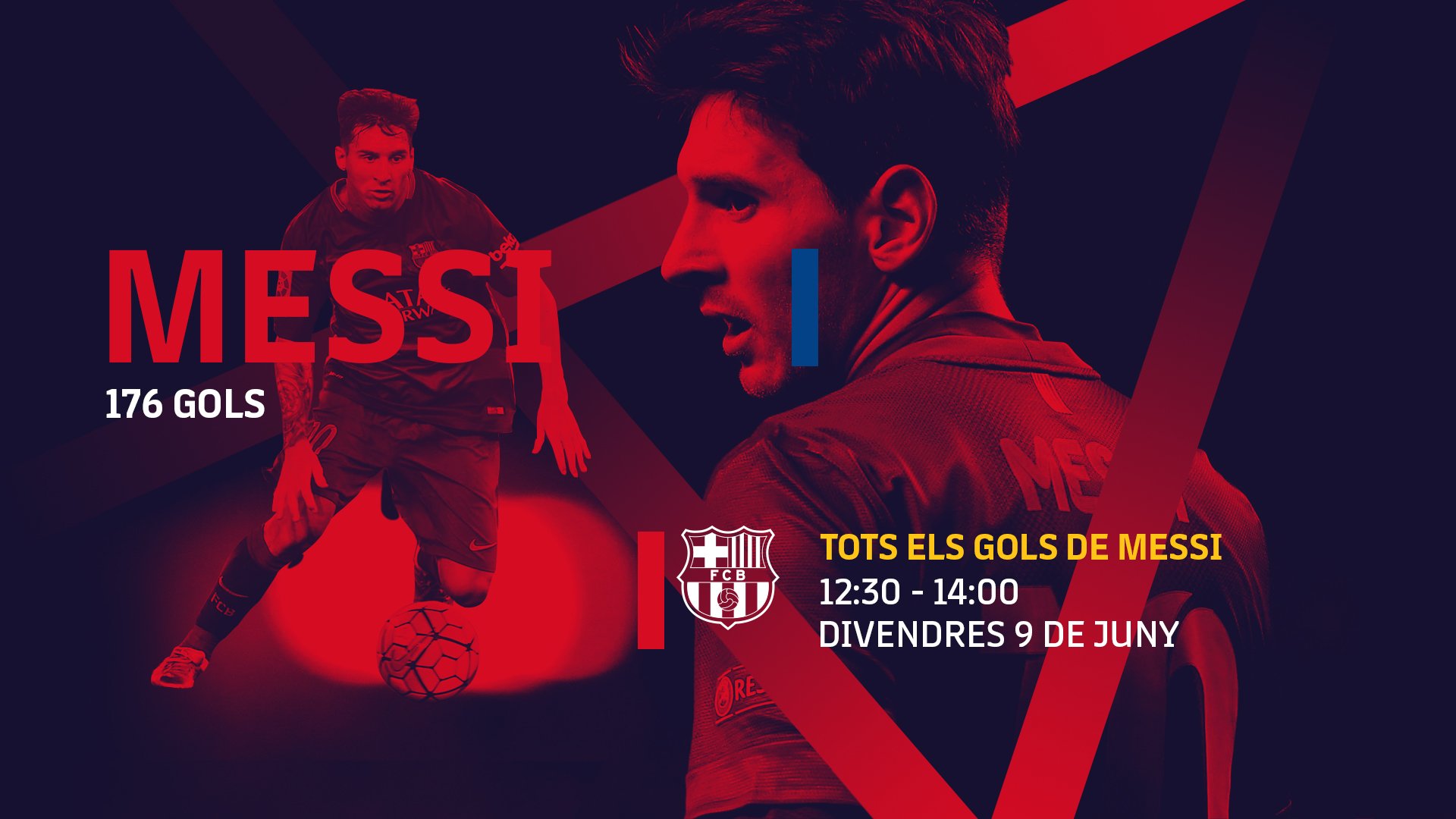
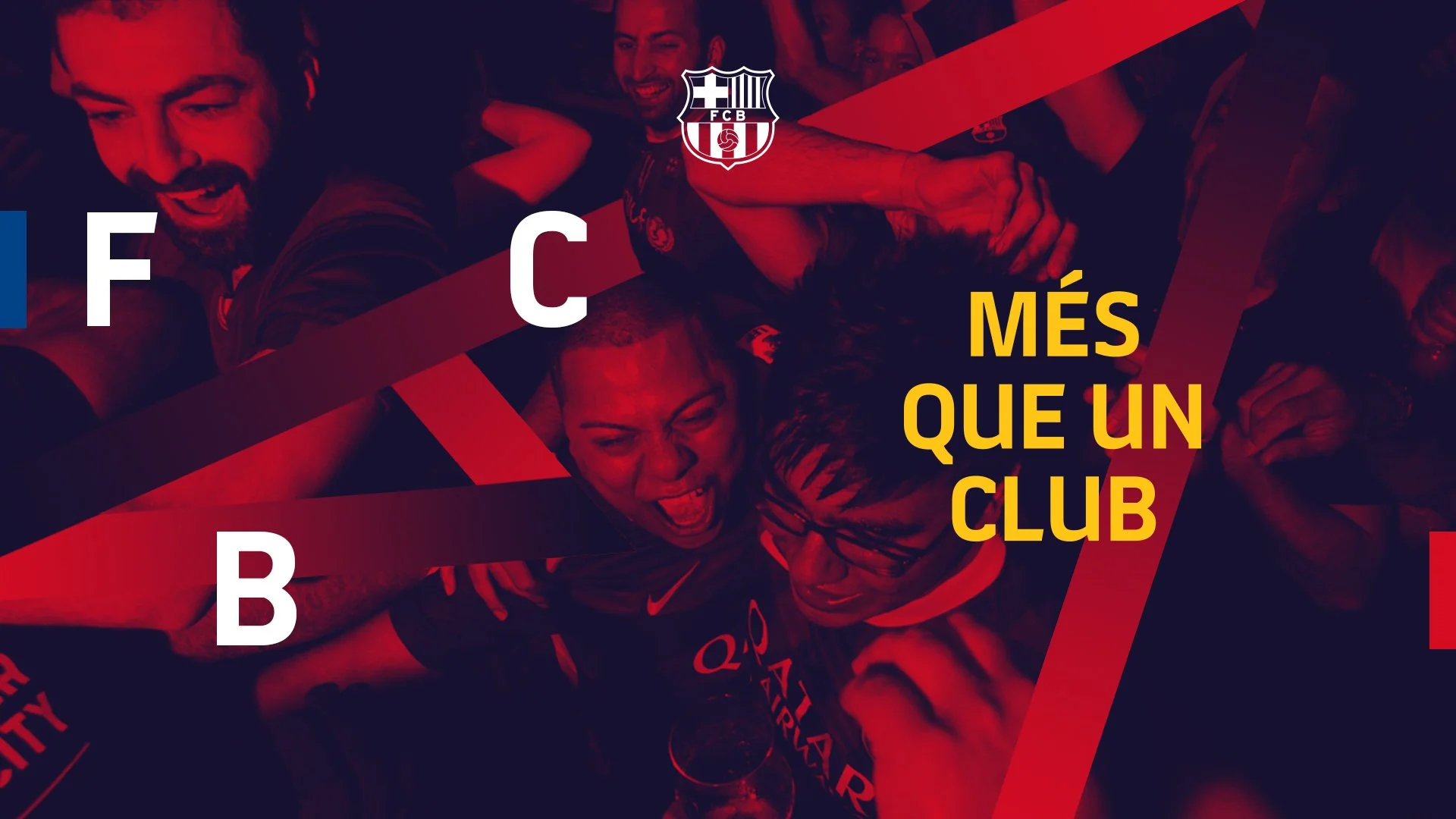
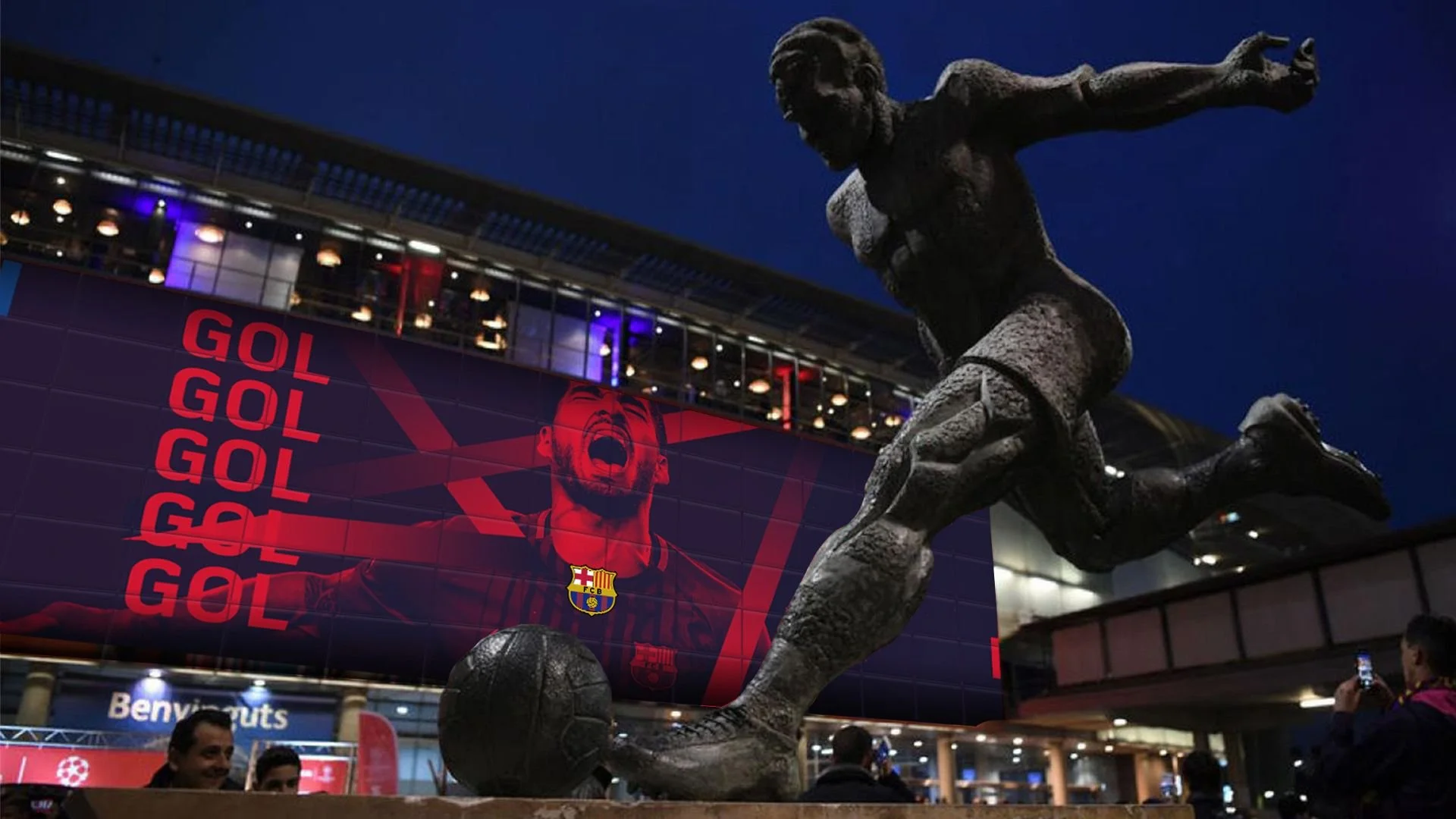
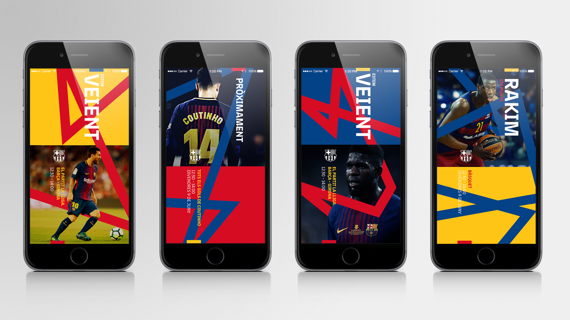
FC Barcelona - A Brand That Moves Like It Plays
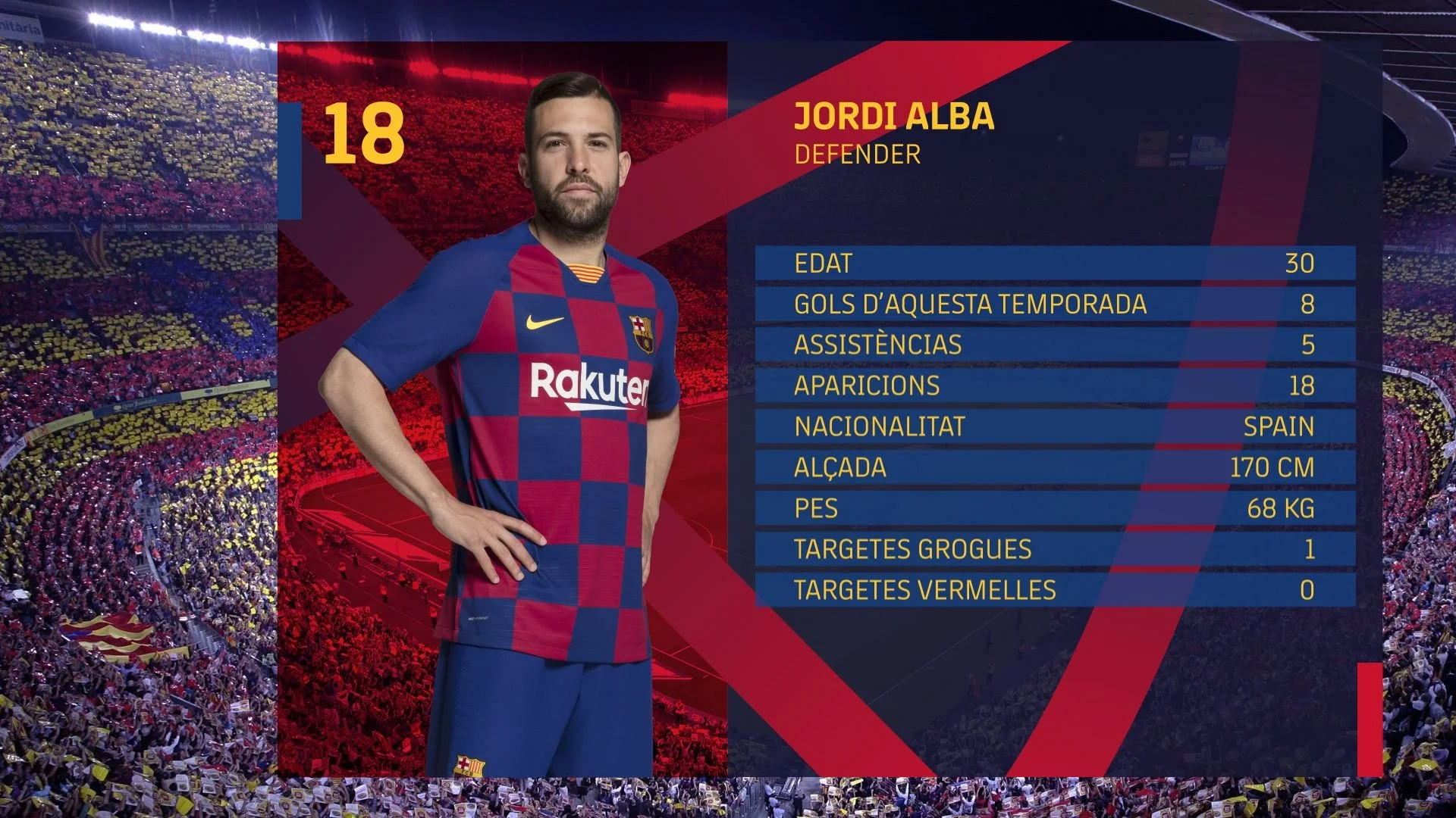
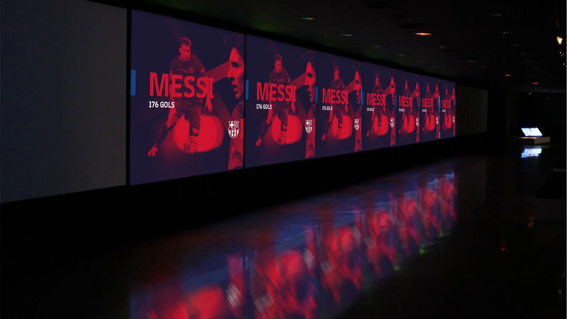
At the core is a motion-led system built around flow and connection. Elements move in continuous sequences, forming and reforming through triangular patterns that echo the dynamics of passing play. Graphics don’t sit statically - they interact, transition, and evolve, creating a sense of momentum across every frame.
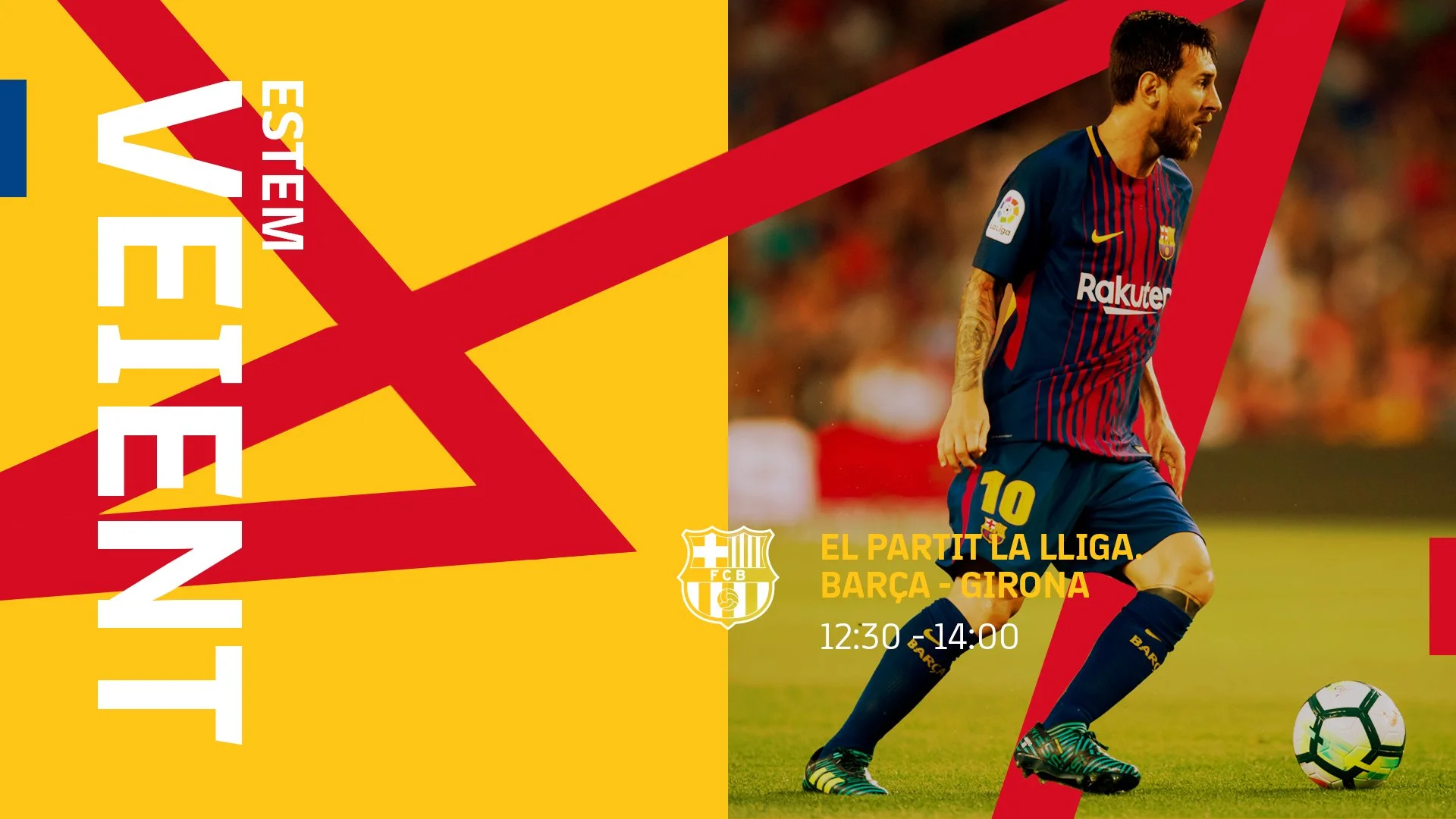
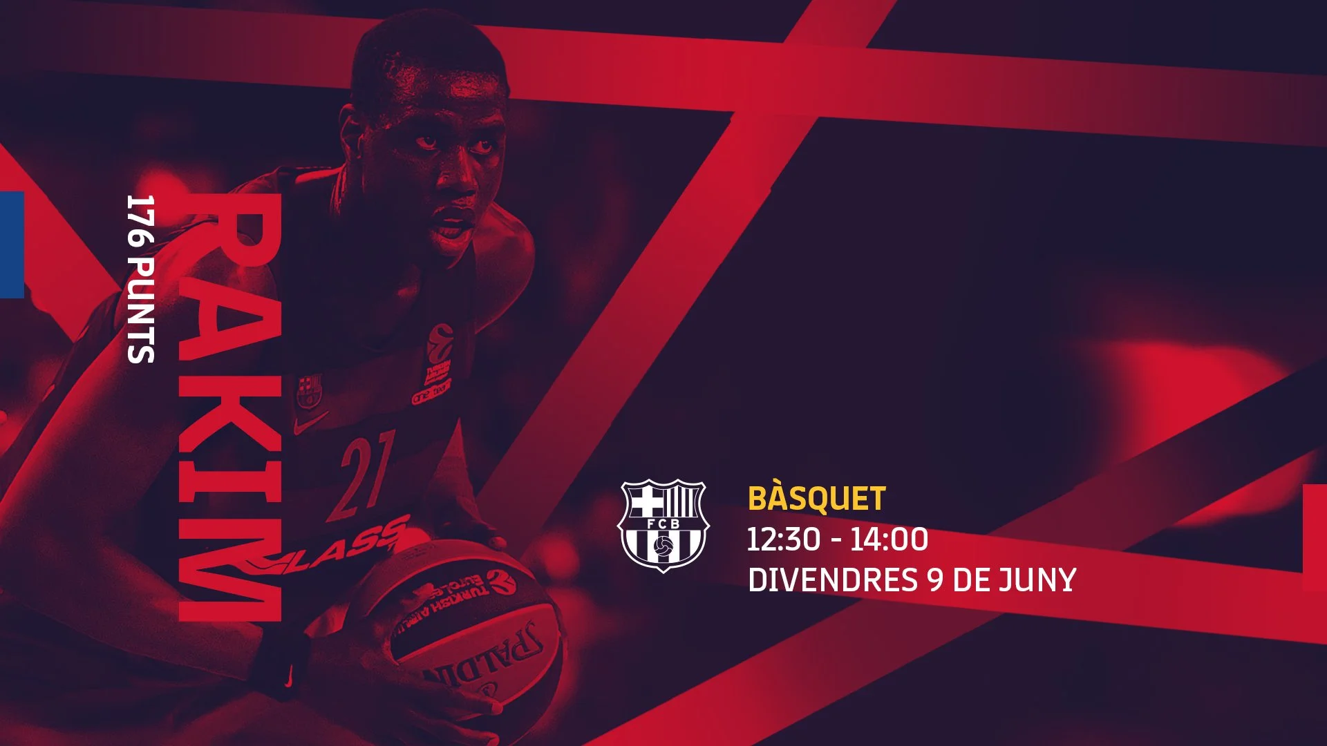
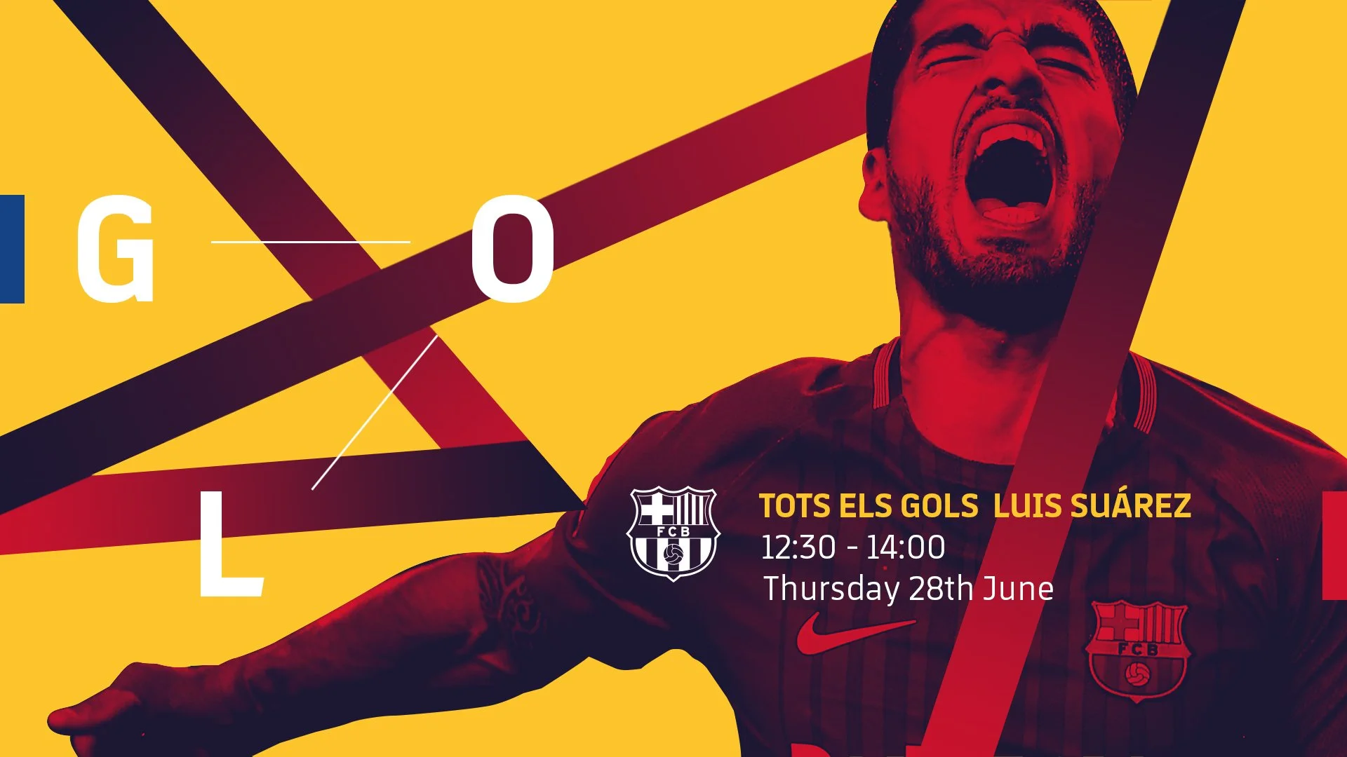
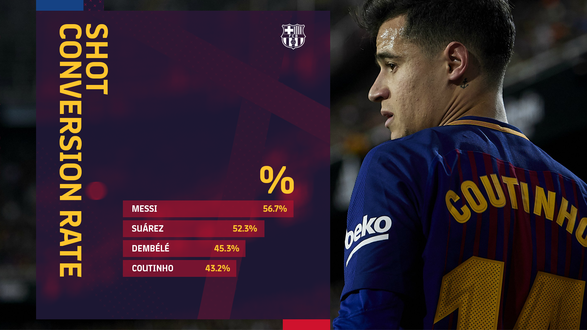
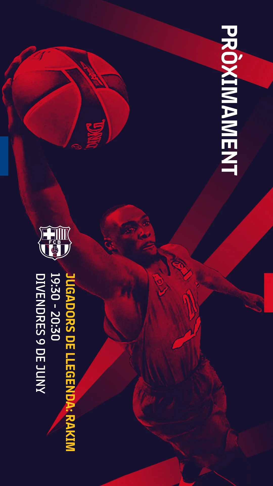
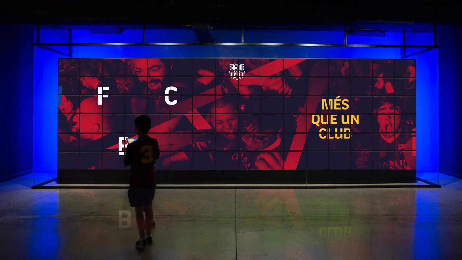
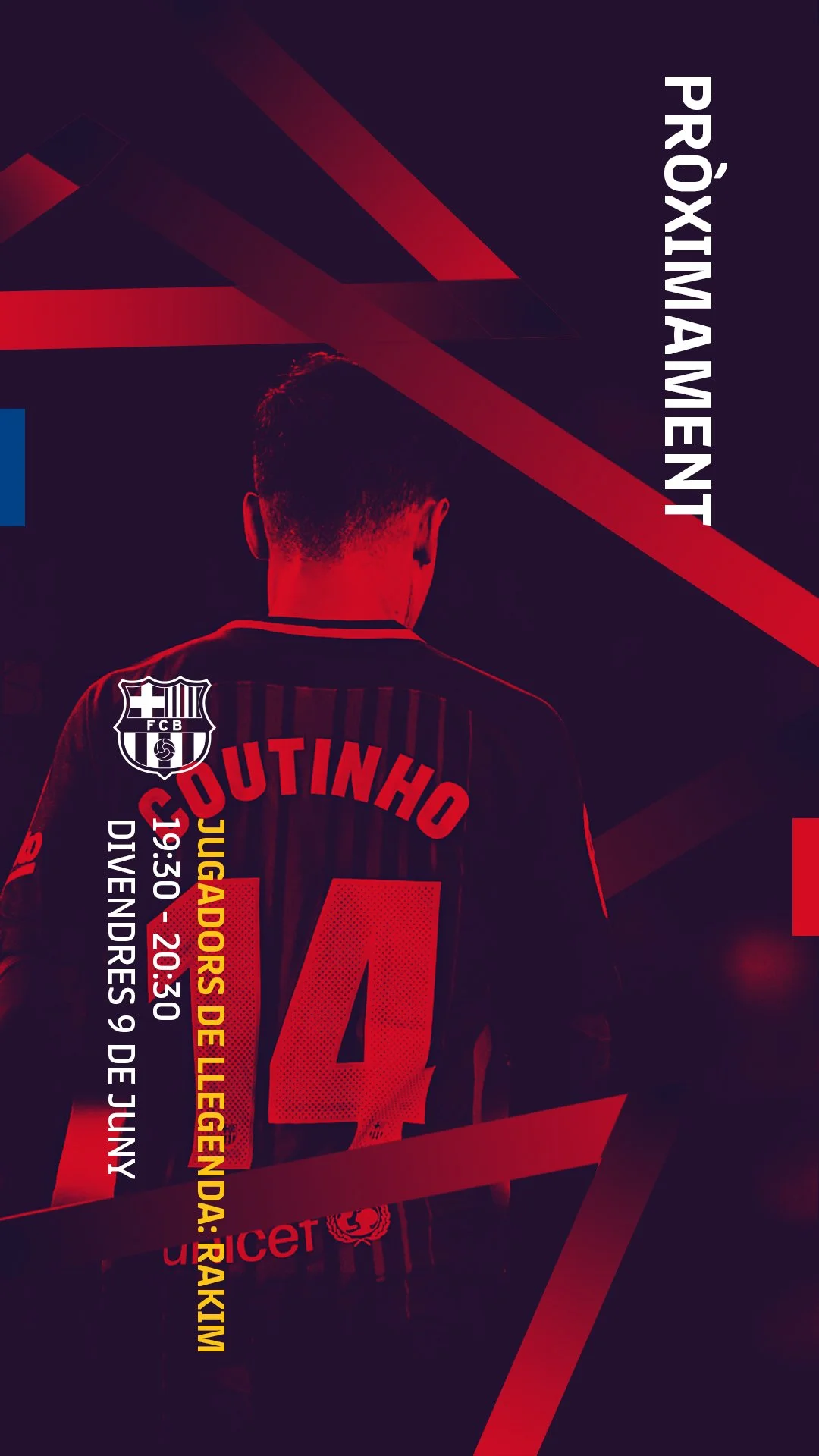
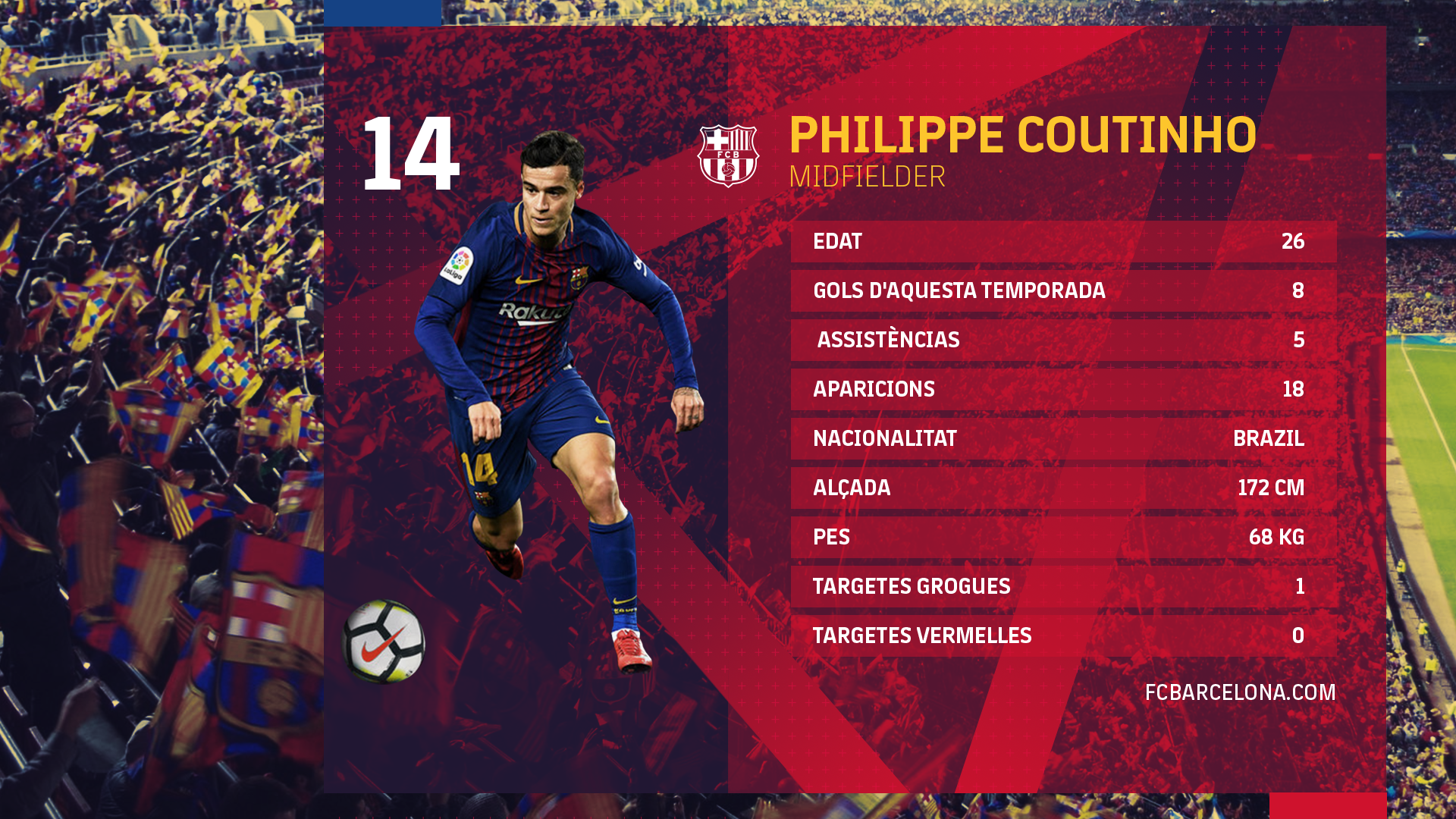
This approach allowed the identity to scale fluidly across formats. From live broadcast graphics to in-stadium screens and social content, the system adapts while maintaining a consistent sense of energy and intent.
Rather than a fixed set of assets, the result is a living visual language - one that behaves like the team itself: fast, intelligent and always in motion.